Art always has a story. The journey from start to finish is never fully told in the final product, and this one for Tone Sosa’s Cuts was no different.
Before designing any logo, there is usually a brainstorming process. There may be rough sketches, color theorizing and/or a study of industry comparables that eventually leads to an effective and original design…This was nothing like that.
One night, I had a dream—yes that’s right, a dream—where I saw the logo idea for Antonio Sosa’s fast-growing barbershop and grooming business. I told him about it. He laughed, of course, but he gave me the go-ahead to begin designing. The “T” in “Tone” was the perfect letter, since “T-trimmers” is actually a type of clipper. “Sosa’s” was just a slightly modified font, positioned to be the cord of the T-trimmers. I loved the use of red, being such an attention grabbing color, especially since many of his haircuts are so attention-worthy. In the end, he loved it. Since the creation of his brand design, Tone Sosa’s Cuts has grown significantly, and there are barely enough time slots in the day for those in need of his services. And to think it was all a dream. If only it were this simple every time.
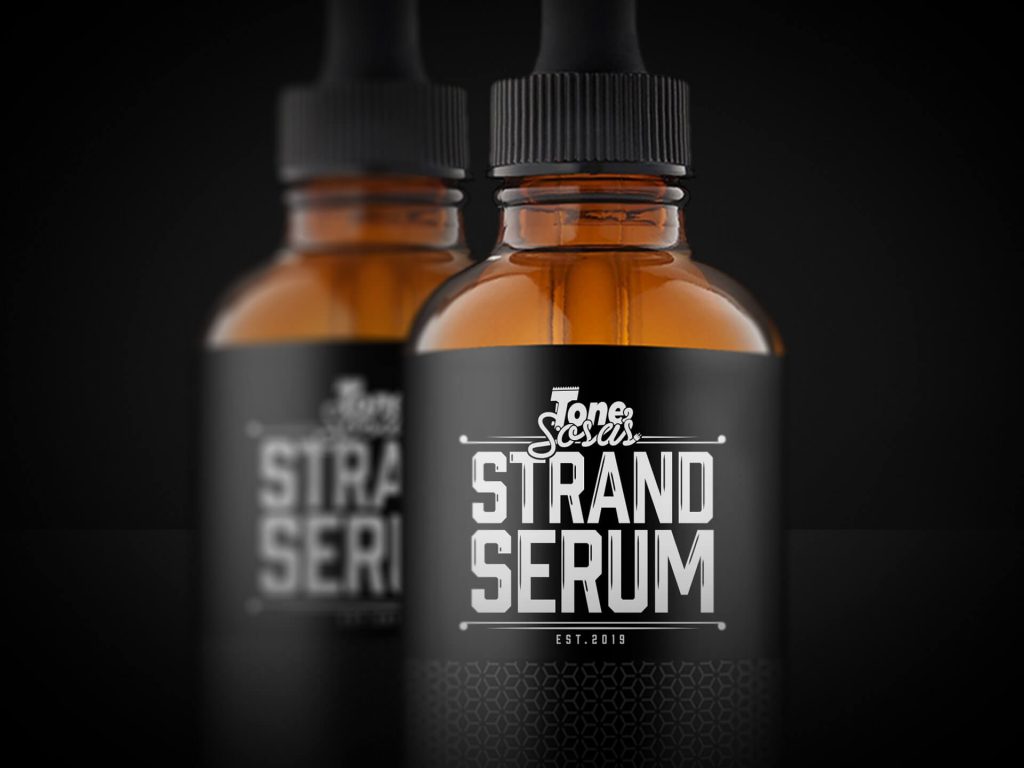
Since the design of that logo, Antonio has started production of a new strand serum. To maintain the brand identity, I kept the original design and coupled it with “STRAND SERUM”. I chose a bold font and enlarged the text to make sure it would be clear what the product was.